Designing Eye-Catching Skateboard Competition Flyers
Skateboarding competitions are more than just a contest of skills—they’re a celebration of culture, creativity, and community. To capture that spirit and draw in participants and spectators, the flyer for your event needs to stand out. Here’s how to design an eye-catching skateboard competition flyer that commands attention.
1. Bold and Dynamic Visuals
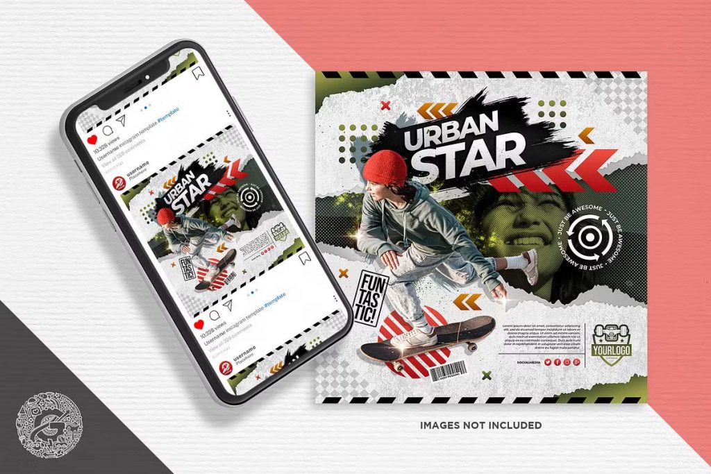
The visual appeal of your flyer is the first thing people notice. Skateboarding is all about movement, energy, and style, so your flyer should reflect that. Use bold colors like neon greens, electric blues, or vibrant oranges that pop off the page. Incorporate dynamic imagery—think action shots of skateboarders mid-air, close-ups of boards grinding on rails, or abstract graphic elements that convey speed and agility. Experiment with different compositions to make your flyer as lively and energetic as the competition itself.
2. Edgy Typography
Typography plays a crucial role in setting the tone of your flyer. For a skateboard competition, opt for fonts that are edgy, rugged, or graffiti-inspired. You want your text to look as if it could be spray-painted on a wall or scratched into a deck. Play around with different font sizes and weights to create a hierarchy that guides the viewer’s eye through the flyer. The event title should be bold and dominant, while details like date, time, and location can be smaller but still legible. Don’t be afraid to tilt or skew text to add to the dynamic feel.
A4 Skateboard Competition Flyer
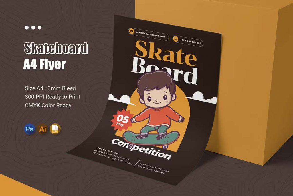
Skateboard Competition Flyer
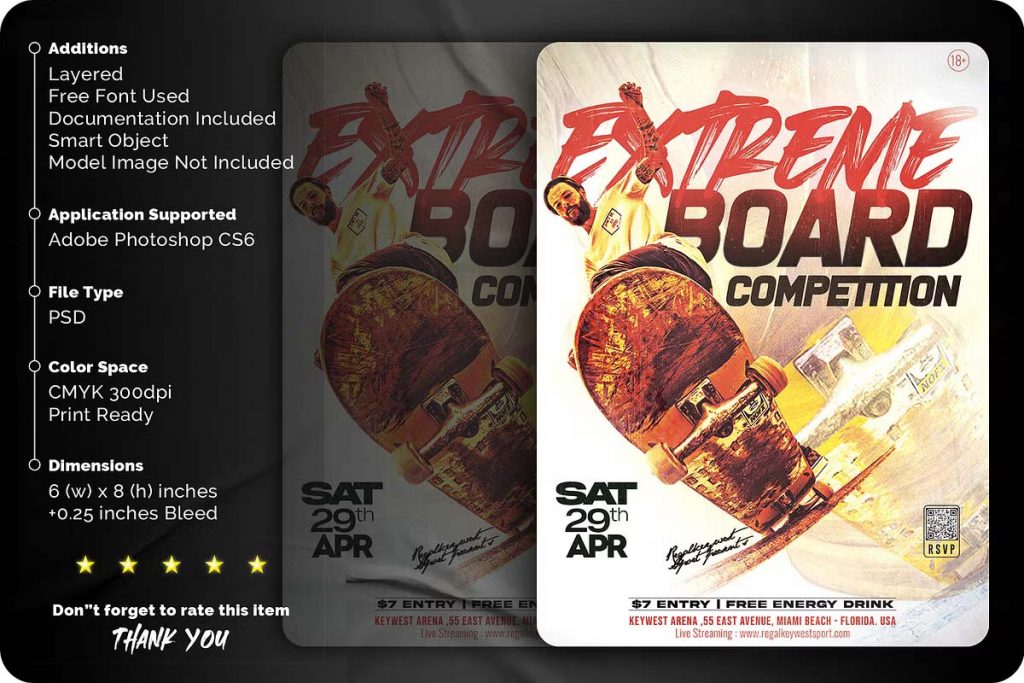
Skateboard Competition Flyer
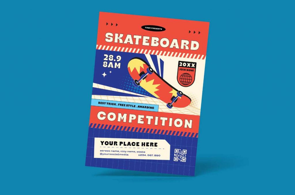
Skateboard Competition Flyer
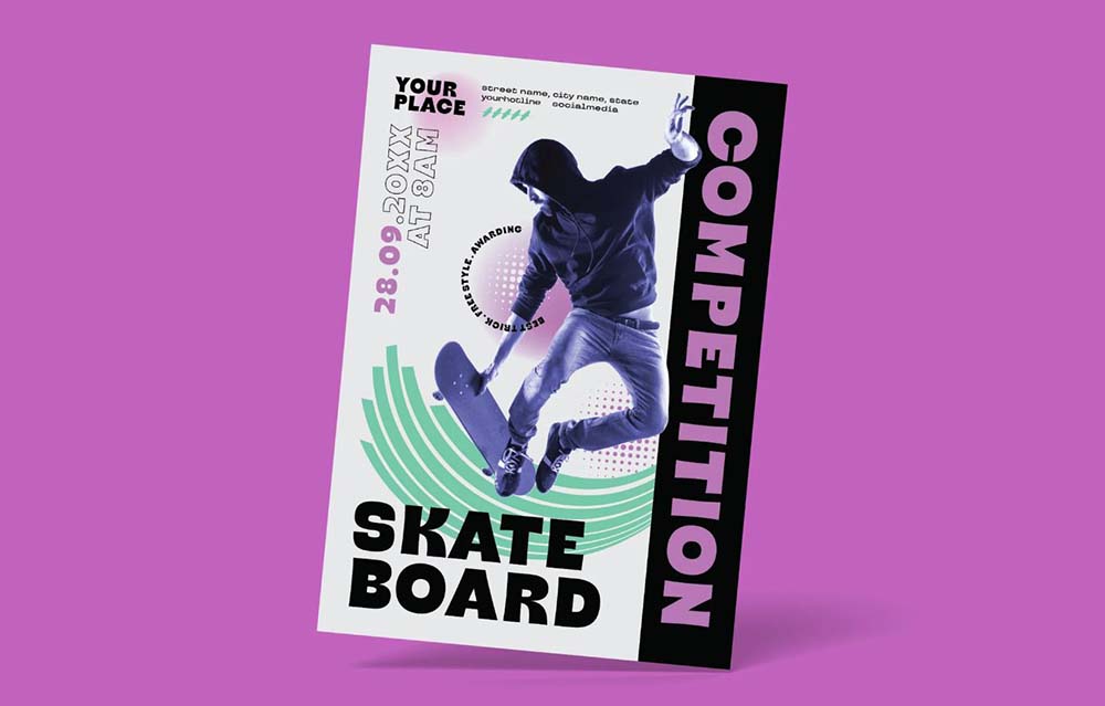
Skateboard Competition Flyer Media
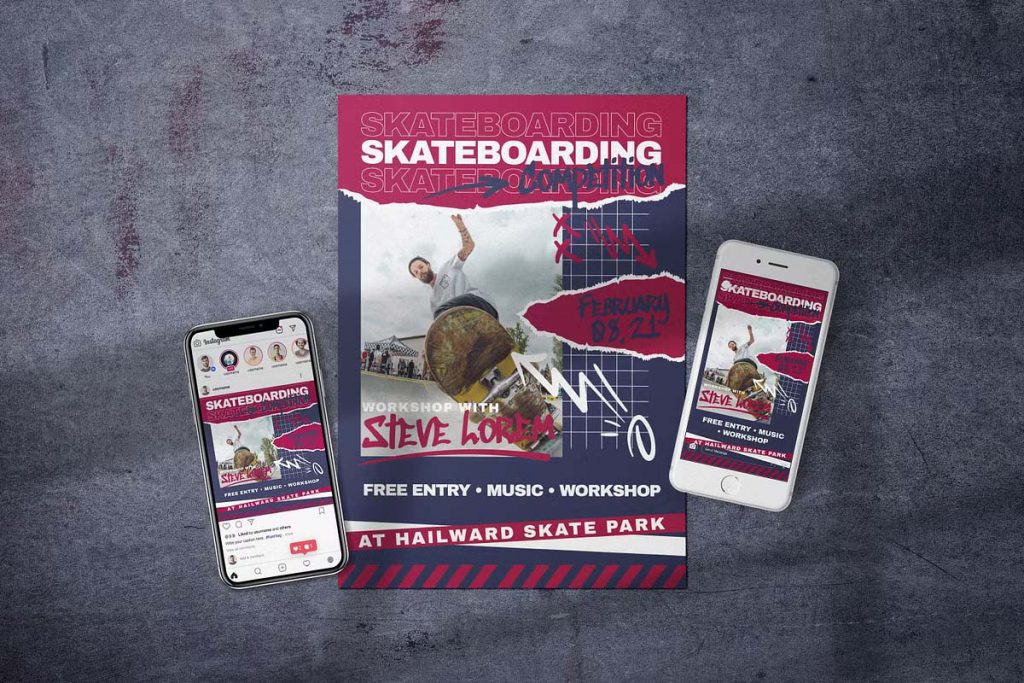
PSD Skateboard Championship Flyer
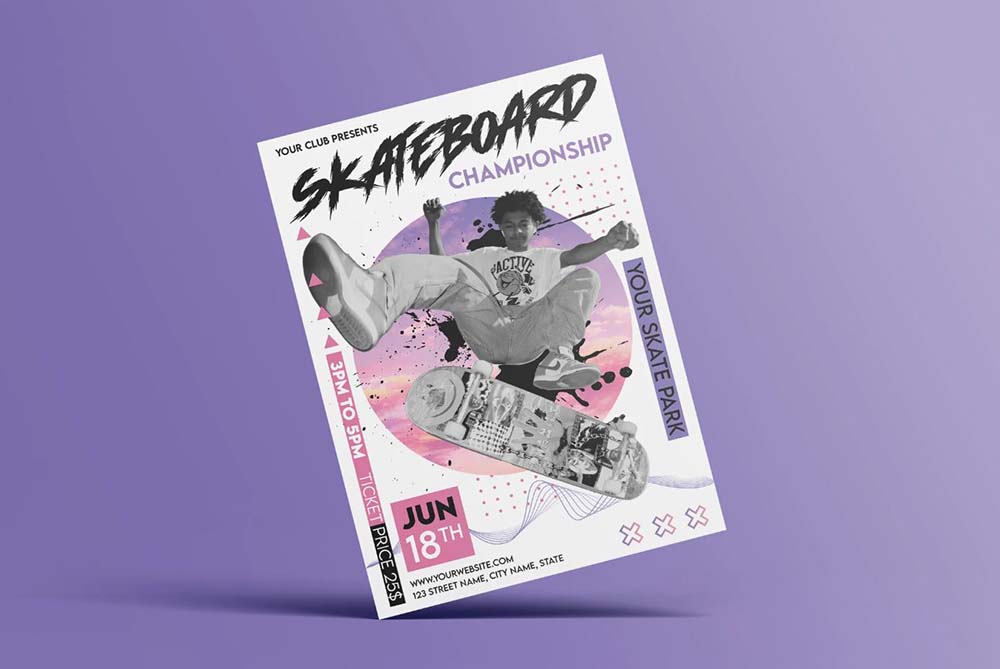
Skateboard Competition Flyer – PSD,Ai
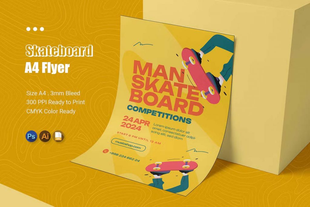
Skateboard Competition Flyer Template
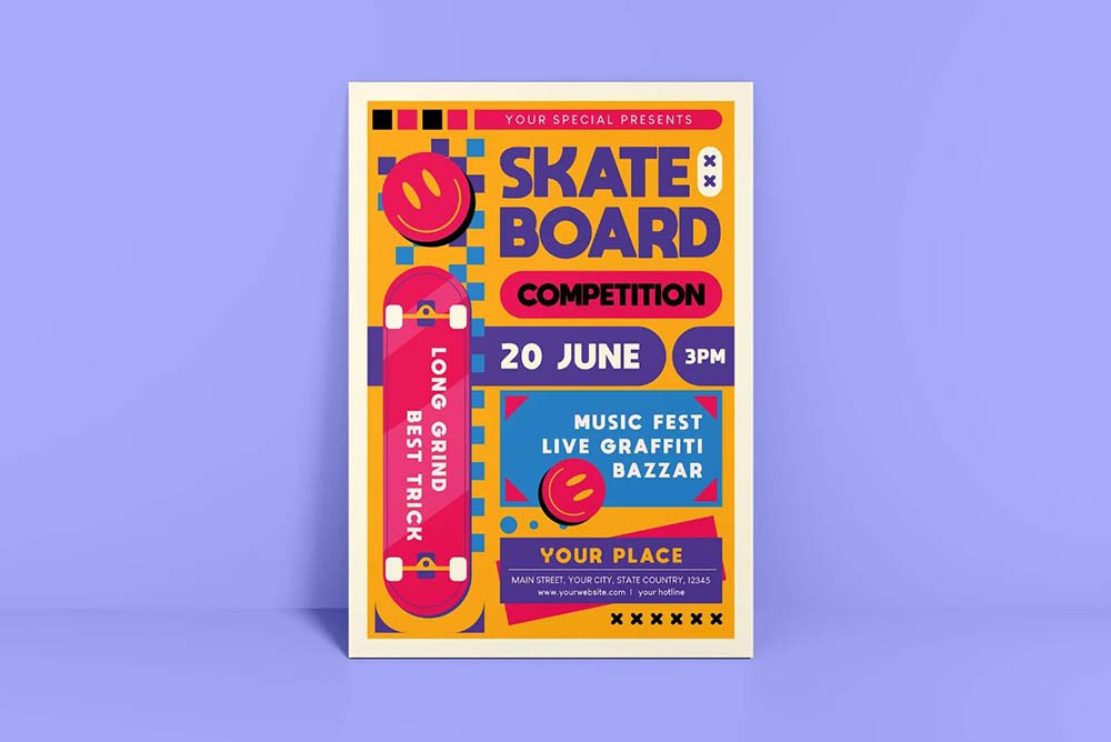
Skateboard Flyer Social Media
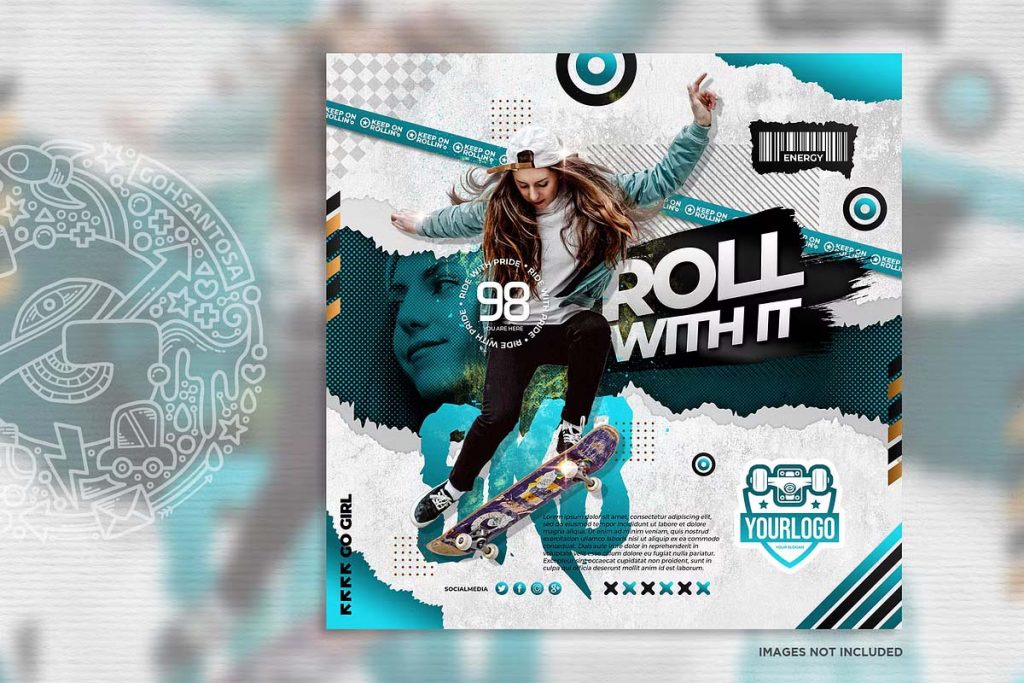
Skateboard Competition Flyer Designs
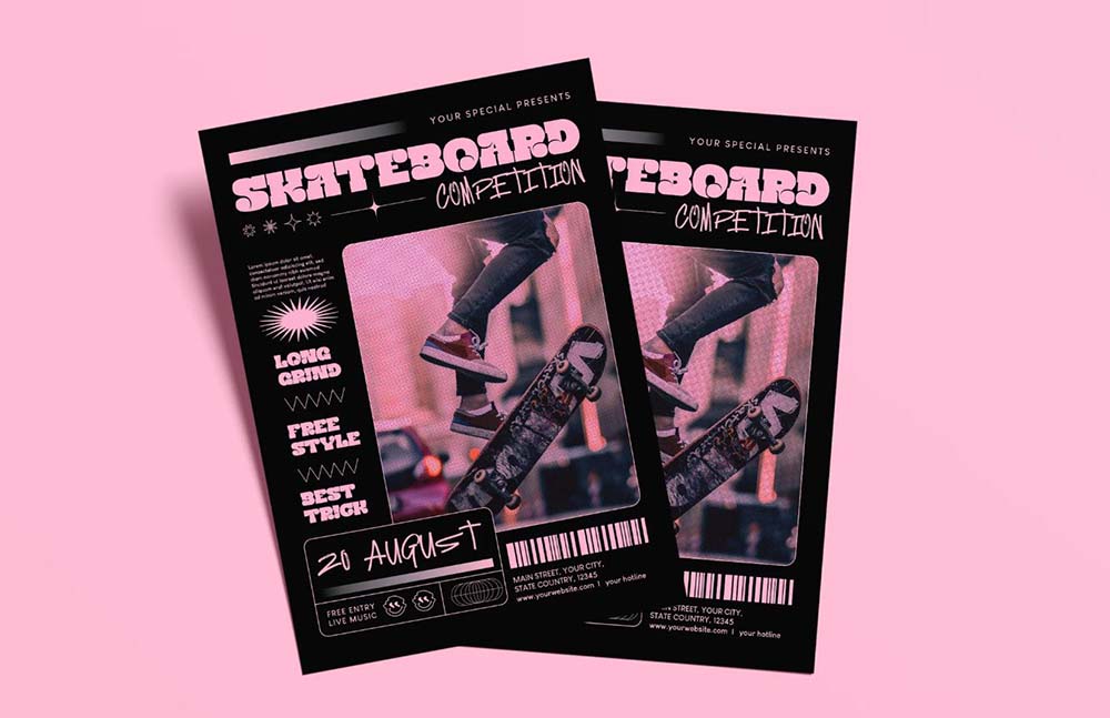
Skateboard Flyers Social Media
3. Highlighting Key Information
While the design should be visually engaging, the flyer also needs to communicate essential information clearly. Make sure the event’s date, time, and location are easy to find. Consider adding icons or symbols to represent each of these details, making the flyer more intuitive and visually appealing. If there are any special guests, prizes, or rules that participants need to know, give those elements some prominence. QR codes are also a great way to link to more detailed information, like registration forms or event pages.
4. Incorporating Local Culture
Skateboarding is deeply rooted in street culture, and every community has its own unique style. Incorporate local elements into your flyer’s design—this could be anything from the city skyline to local street art, or even a nod to local slang or iconic spots known to skateboarders in the area. By adding these personalized touches, you make the flyer resonate more with the community and create a sense of ownership and pride around the event.
5. Finishing Touches: Textures and Effects
Adding textures and effects can give your flyer an authentic, gritty feel that aligns with skate culture. Consider using distressed textures, grunge overlays, or brushstroke effects to give the design a raw, unpolished look. These finishing touches can elevate the overall design, making it not just a flyer, but a piece of art that people want to keep.
A well-designed skateboard competition flyer is more than just an announcement—it’s an invitation to be part of something exciting and vibrant. By combining bold visuals, edgy typography, clear information, and local culture, you can create a flyer that not only attracts attention but also embodies the spirit of skateboarding.

