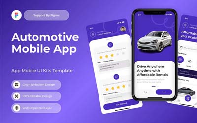
As the demand for car rentals continues to grow globally, offering a seamless user experience through a well-designed mobile app is crucial for success. Rental Car Mobile apps for car rentals must be intuitive, functional, and aesthetically pleasing, ensuring users can quickly and efficiently book cars, manage reservations, and explore other features. Below, we explore the core components of an ideal rental car mobile app UI design.
1. Simple and Intuitive Navigation
A rental car mobile app needs to prioritize user convenience. A clean and minimalistic design helps users find what they’re looking for without overwhelming them with information. The navigation bar should feature easy access to key features such as booking, vehicle selection, and user profiles.
Implementing a straightforward layout with drop-down menus, clear icons, and a search function allows users to efficiently locate the perfect car. Organizing rental categories based on vehicle types, price ranges, or user preferences can further streamline the booking process.
Rental Car Mobile App
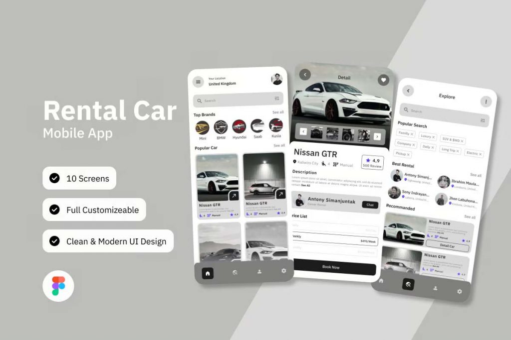
Rental Car Mobile App UI Template
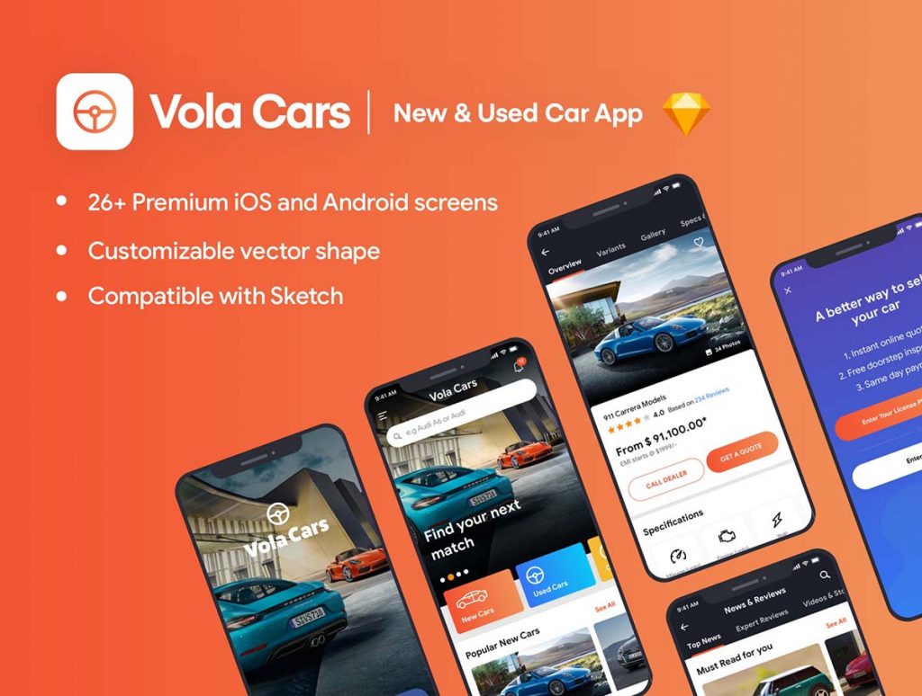
Cars Premium iOS App UI Kit Sketch
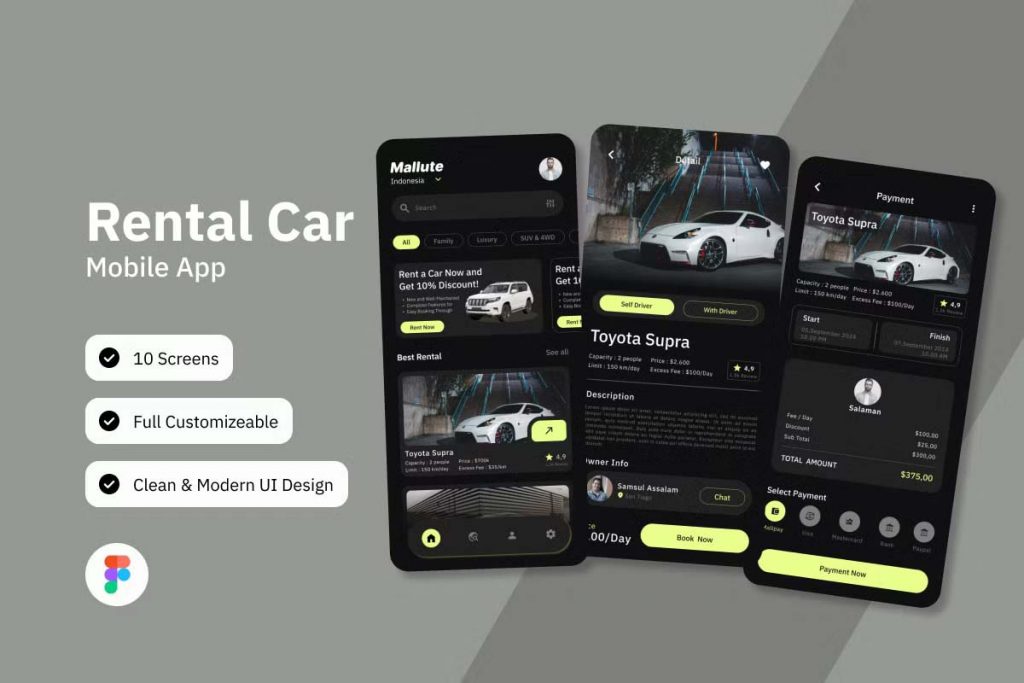
Rental Car Mobile App Ui Kit
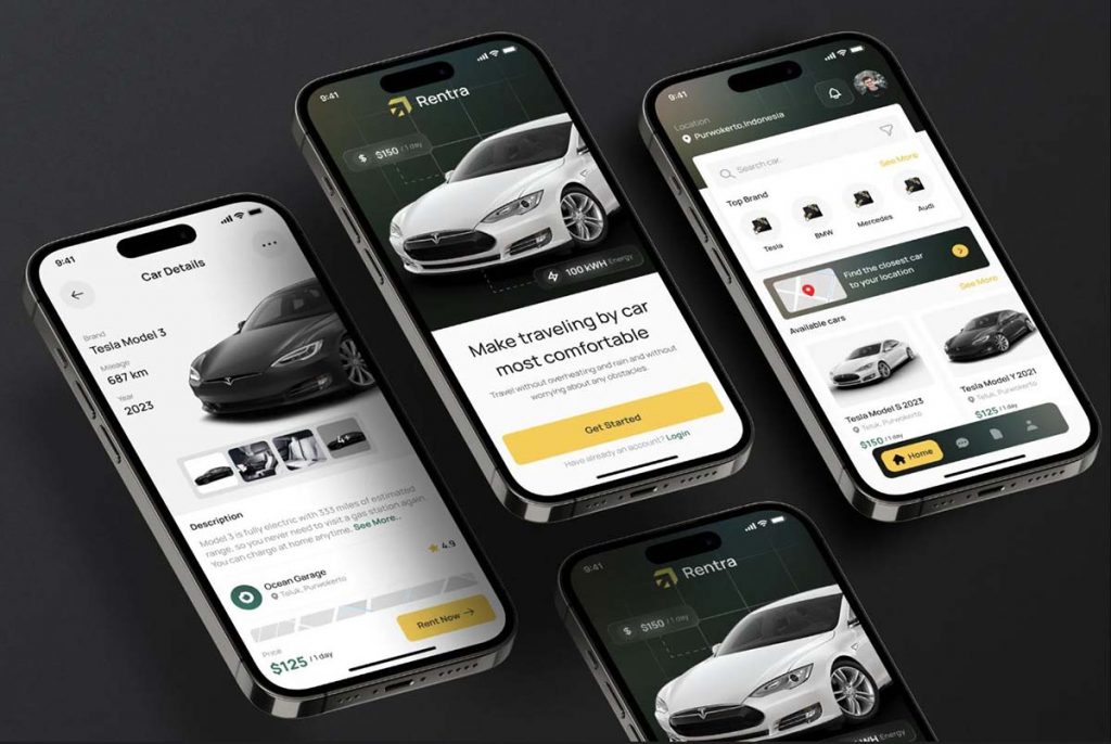
Premium Car Rent App
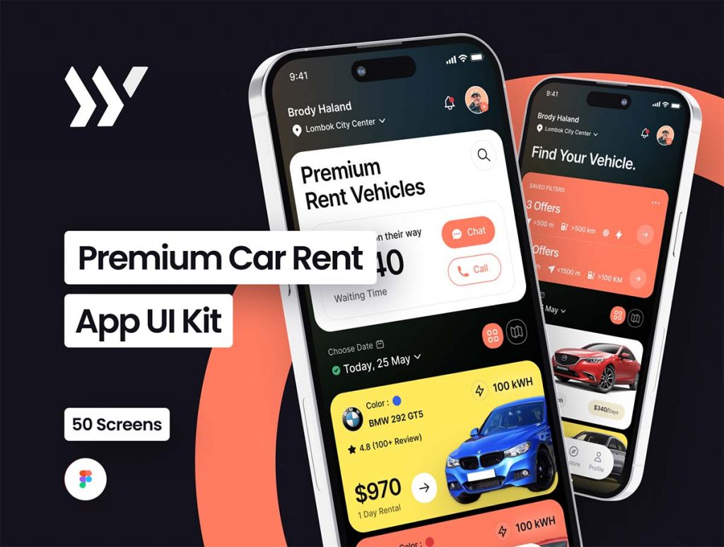
Car Rental UI Kit
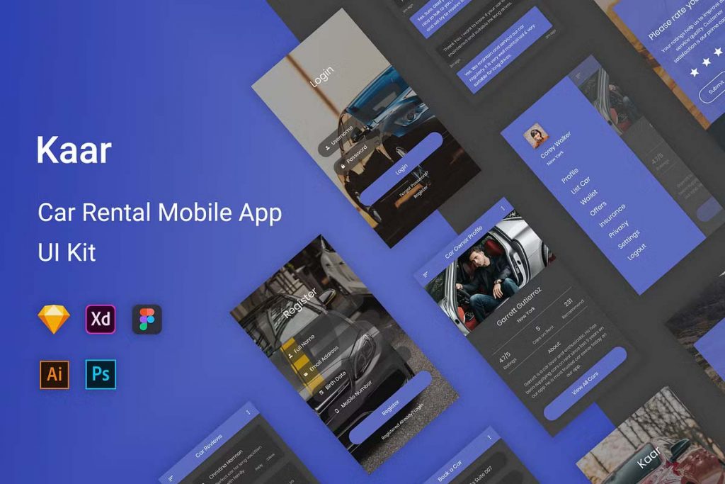
Premium Car Rental App UI Kit with Modern and Minimalist Style
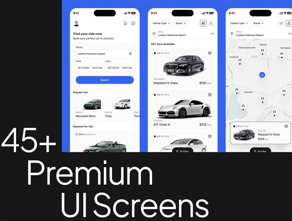
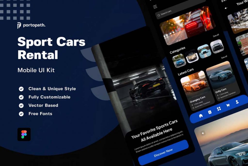
Sport Cars Rental Mobile Apps
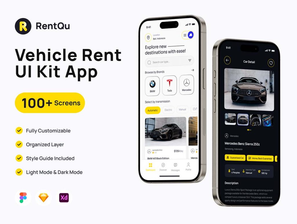
Car Rental UI Kit App
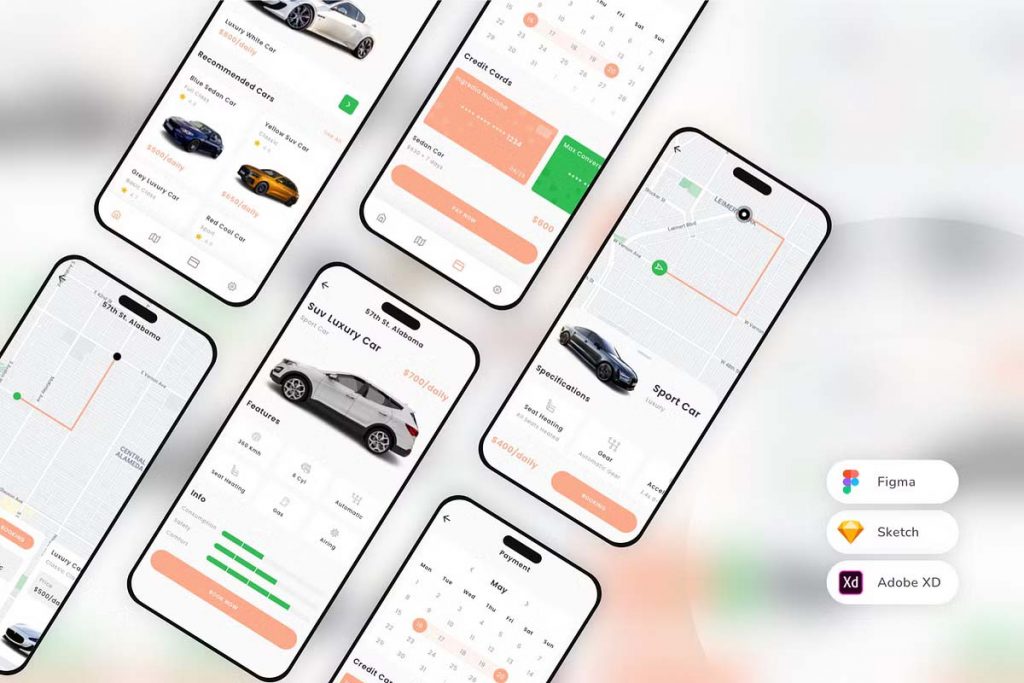
Luxury Car Rental Mobile App UI Kit
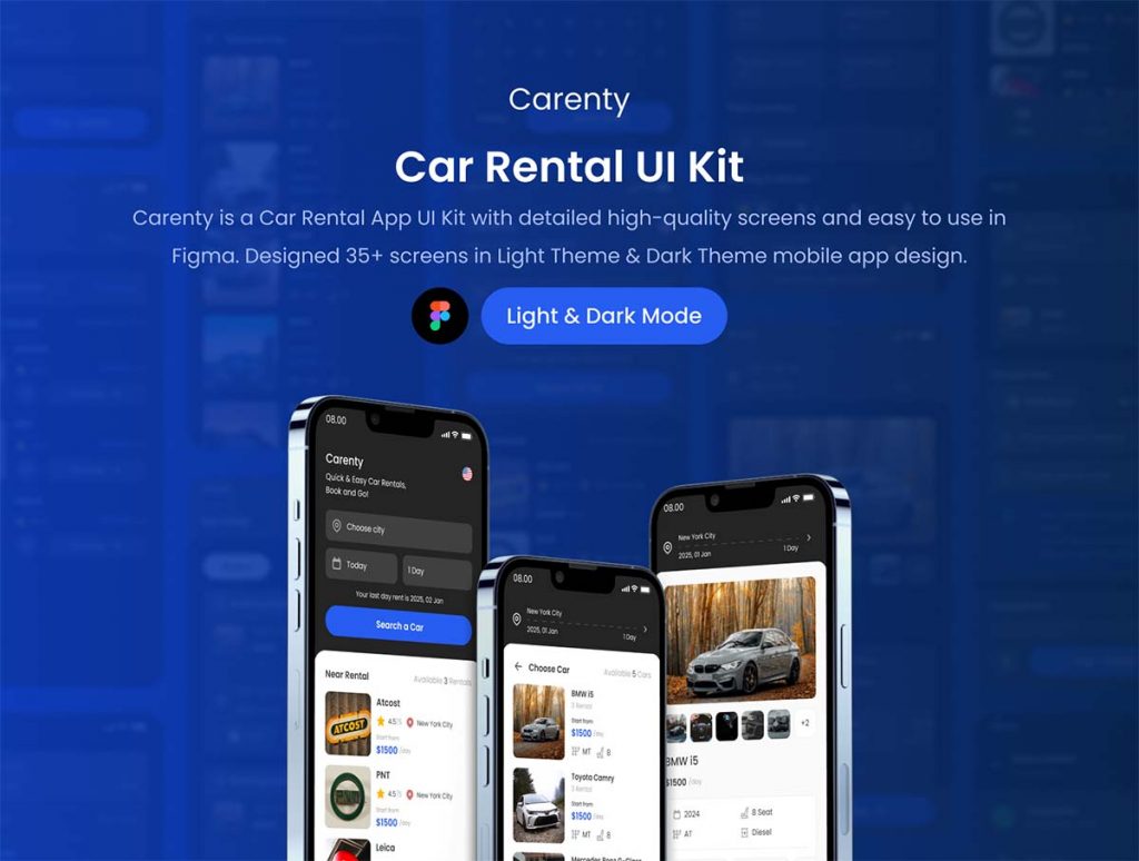
Car Rental UI Kit with 35+ High-Quality Screens
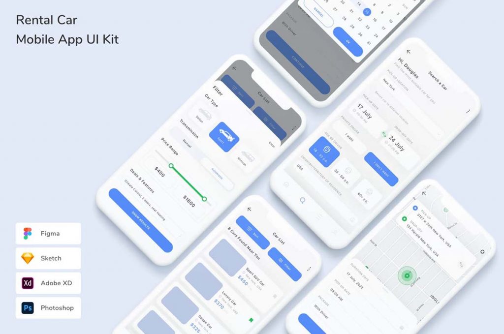
Rental Car Mobile App UI Kit
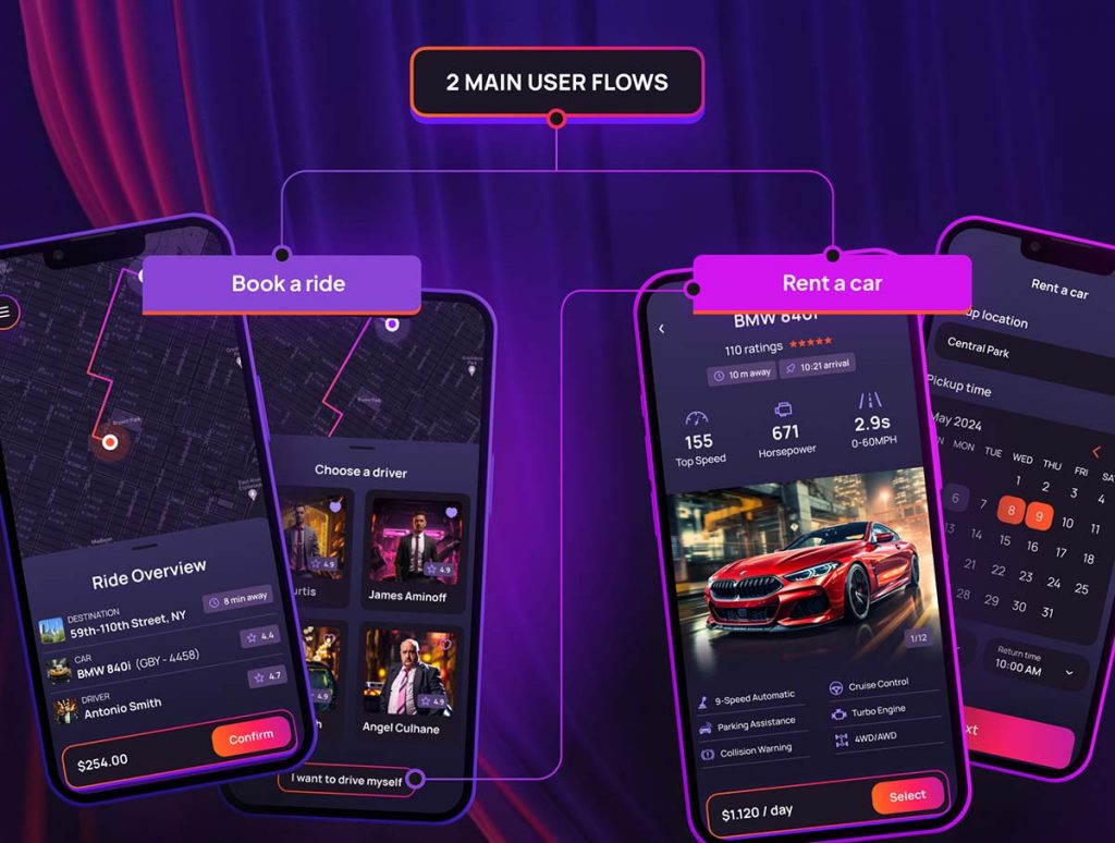
Taxi and Car Rental Mobile App
Car Rental Mobile App UX Template
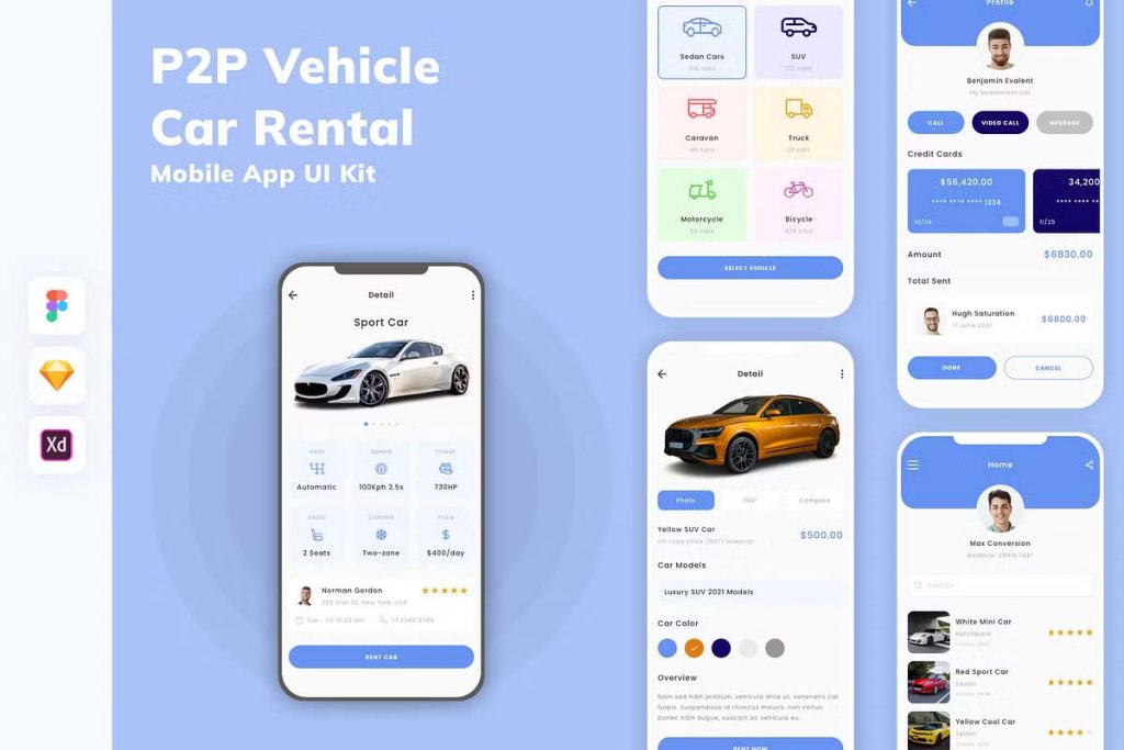
Car Rental App UI Kit
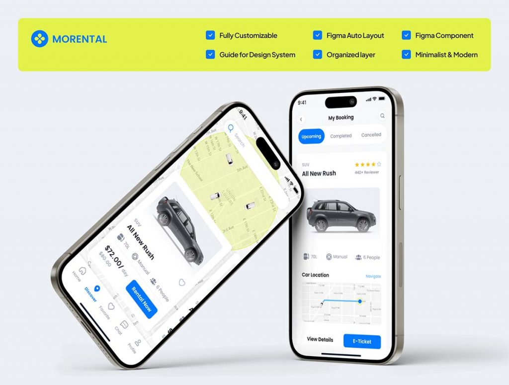
Rental Car Mobile App Design
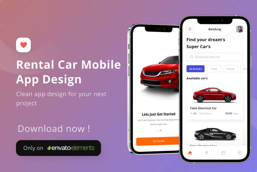
Rental Car Mobile App Template
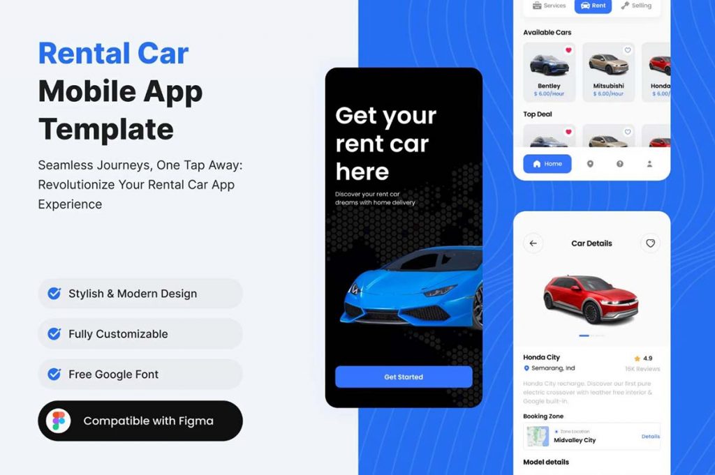
Auto Rental Mobile App UI Kit
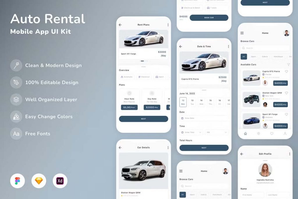
Vehicle Car Rental Mobile Apps
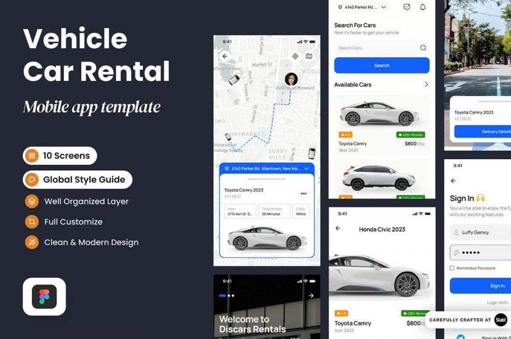
Car Rental Service Mobile App UI Kit
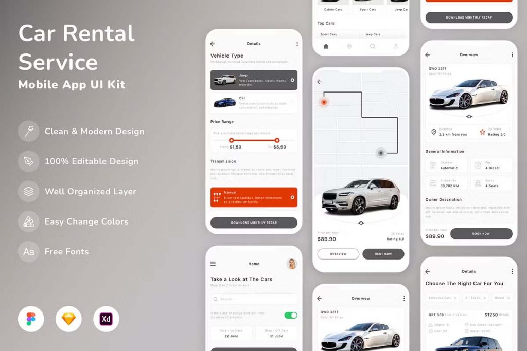
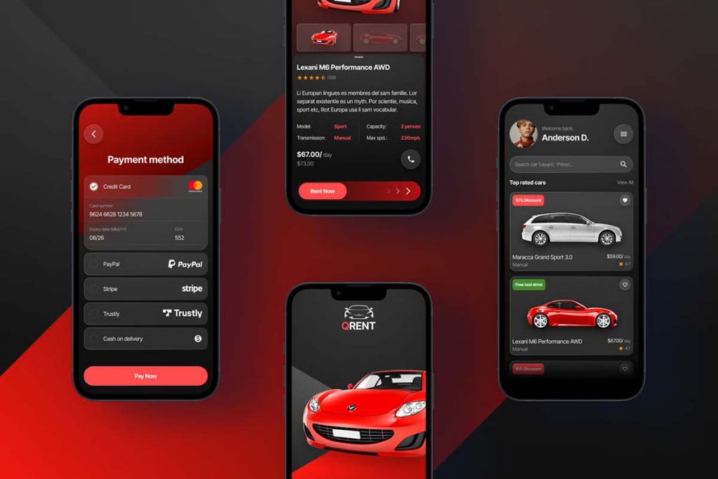
Car Rental Mobile App Figma Template
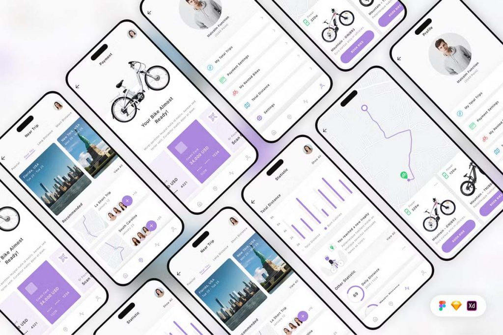
Bike Rental Mobile App UI Kit
2. Vehicle Search and Filters
Incorporating advanced search filters into the app’s design can help users refine their preferences and find cars faster. Common filter options include location, vehicle model, price range, rental period, and car features such as fuel type or transmission.
Search filters should be easy to use with visually engaging elements like sliders, toggle buttons, or checkboxes. A quick preview of available vehicles within a user’s range of criteria allows them to make informed choices before moving forward with the booking.
3. Visual Car Selection Process
A key aspect of rental car mobile app UI is the car selection interface. High-quality images and car details should be presented clearly, allowing users to make decisions based on accurate visuals and comprehensive descriptions. Employing a card-based layout for each car helps users easily compare options, featuring key details such as price per day, fuel efficiency, passenger capacity, and customer reviews.
The ability to swipe through different vehicles, zoom in on images, and read user reviews can enhance the overall experience, making the decision-making process smoother.
4. Seamless Booking and Payment
Once the user has selected their car, the booking process should be as smooth and effortless as possible. The app should feature a straightforward flow for inputting rental dates, pickup locations, and drop-off points. A progress bar can help users understand where they are in the booking process.
For payments, integrate secure, quick payment options like credit cards, Apple Pay, or Google Wallet. A confirmation screen summarizing the rental details and payment breakdown ensures clarity.
5. User Profile and History Management
Allowing users to create personal accounts helps personalize their experience. From past rentals to preferred vehicles and saved payment methods, having a well-organized profile section allows for quick future bookings. The ability to track current reservations, extend rentals, or manage cancellations should also be prominent within the user profile interface.
A well-designed rental car mobile app UI keeps users engaged with clean design, clear processes, and functional features, making car rentals as hassle-free as possible.

