Creating a UI Kit for a mobile parking app requires a thoughtful blend of functionality, ease of use, and an appealing design. With the increasing number of vehicles and limited parking spaces in urban areas, mobile apps have become essential tools for drivers looking for convenient parking options. A well-designed Parking Mobile App UI Kit should provide users with a seamless and stress-free experience, making it easy for them to locate, reserve, and manage parking spots with just a few taps.
What is a Parking Mobile App UI Kit?
A UI Kit is a set of pre-made visual components and design elements that make app development faster and easier. For a parking app, a UI Kit includes components like buttons, icons, forms, map views, and navigation elements designed specifically to improve the user experience of finding, reserving, and paying for parking. Designers and developers can use these ready-made components to create a cohesive, user-friendly app that is visually appealing and functional.
Parking Mobile App UI Kit
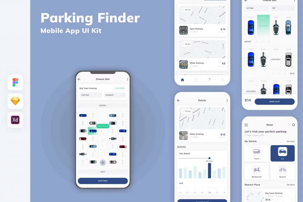
Parking Mobile App UI KIT
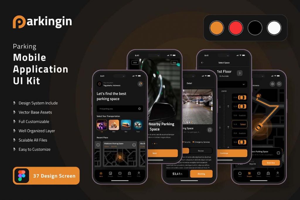
Parking Apps UI KIT
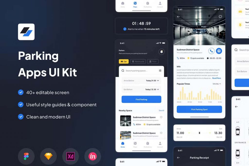
Parking Finder Mobile App – UI Design
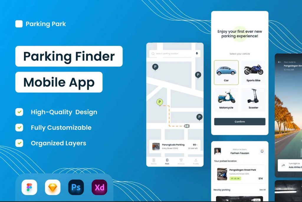
Parking Space Mobile App UI Kit
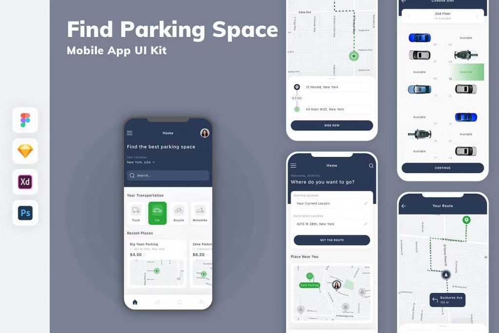
Car Parking Mobile App
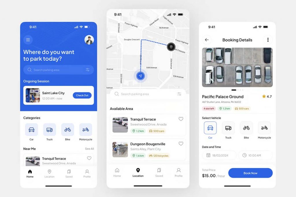
Parking Finder Mobile App UI Kit
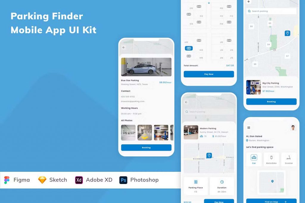
Parking Finder Mobile App UI Kit
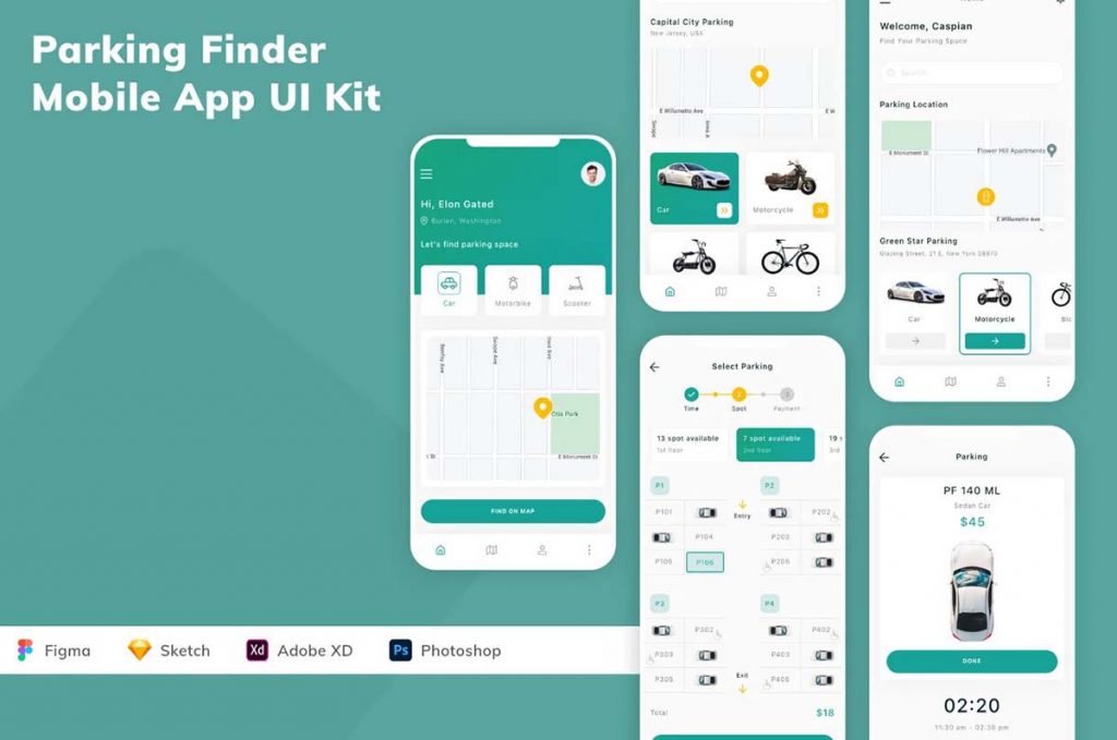
Parking Finder Mobile App UI Kit
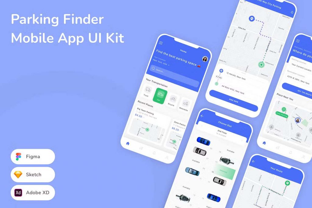
Clean Parking Mobile App UI Kit
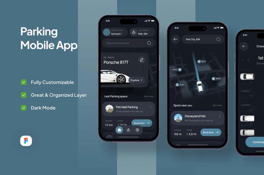
Vehicle Parking Mobile App UI Kit
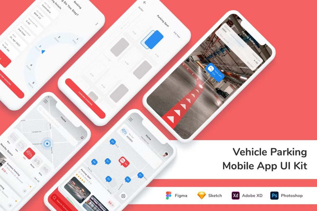
Parking Finder & Parking Garage Mobile App UI Kit
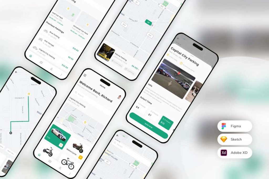
Valet Parking UI Kit App
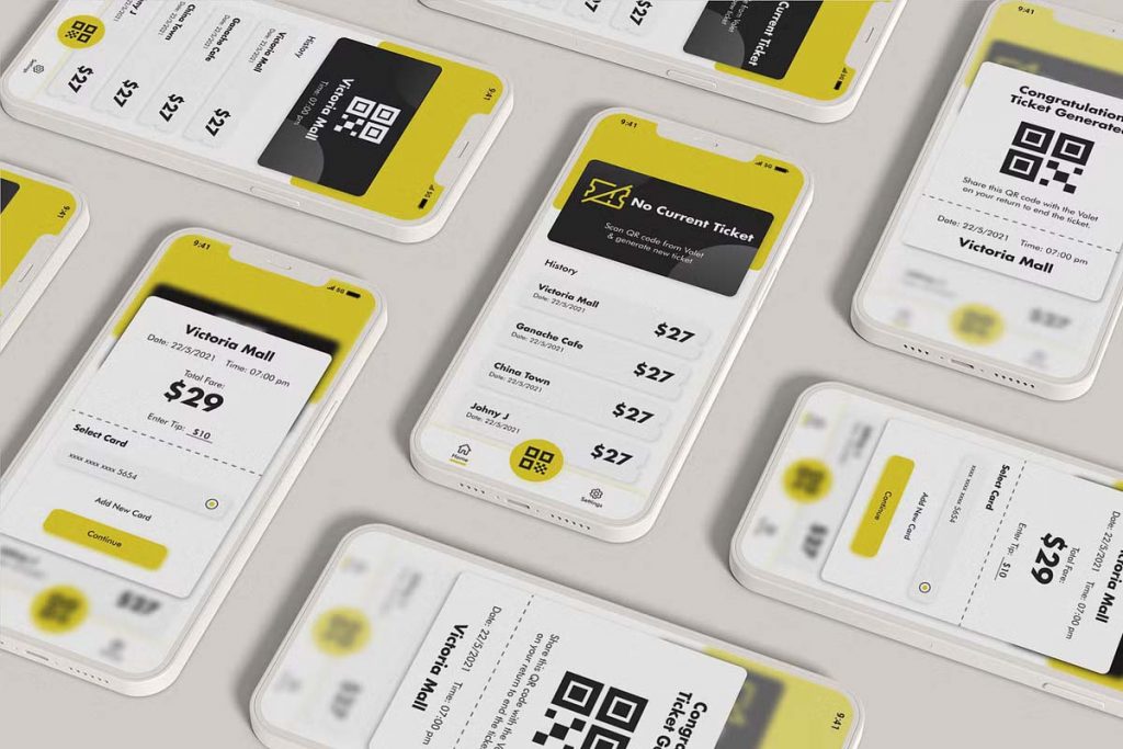
Parking Mobile App UI Design
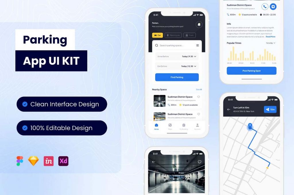
Parking – Mobile App UI Design
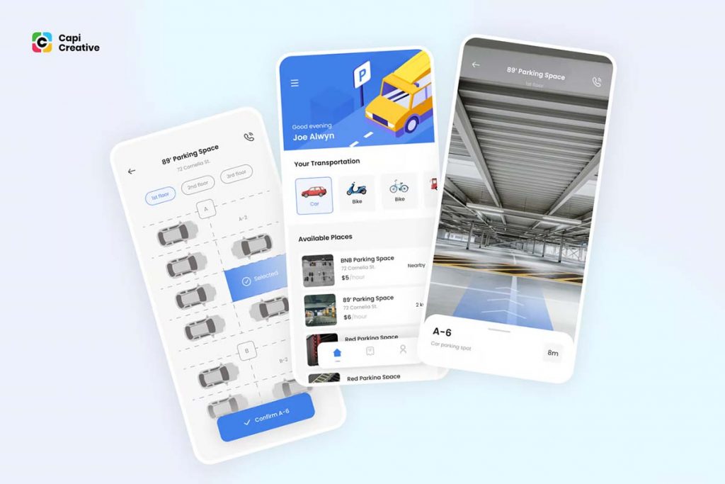
Key Features to Include in a Parking Mobile App UI Kit
- Intuitive NavigationAn effective parking app requires smooth and intuitive navigation to help users easily locate parking spots. Key navigation elements in the UI Kit should include:
- A top or bottom navigation bar to access primary sections like “Home,” “Map,” “Reservations,” and “Profile.”
- A search bar for quick access to specific areas or parking facilities.
- Breadcrumb navigation for clear orientation within the app.
- Interactive Map ViewThe map view is a critical component of a parking app as it provides users with real-time location data and nearby parking options. The map UI should include:
- Dynamic zooming and panning to explore different parking locations.
- Map pins or icons indicating available parking spots with real-time status updates.
- Color-coded markers to differentiate between available, reserved, or full parking areas.
- User-Friendly Reservation SystemThe app should allow users to reserve parking spots quickly. The reservation system should include:
- A date and time picker for selecting the reservation period.
- Confirmation buttons for booking or canceling reservations.
- Visual indicators showing the user’s reserved spot on the map.
- Payment IntegrationSimplified payment processing is essential for a seamless parking experience. The payment UI should feature:
- Multiple payment options, such as credit/debit cards, digital wallets, and pay-later options.
- A secure checkout screen with clear summaries of charges.
- Confirmation notifications for completed transactions.
- Real-Time NotificationsNotifications keep users informed about their reservations, including reminders, expiration times, and parking availability. Notification elements in the UI Kit should include:
- In-app notifications and alerts for a convenient experience.
- Push notifications to inform users of parking spot availability in high-demand areas.
- Reminders for reservation expiration or overstay alerts.
- Profile and Settings SectionAllowing users to customize their app experience can increase satisfaction. A robust profile section should include:
- Account management, with options to update personal information, payment methods, and preferences.
- Past parking history and receipts for easy access.
- Dark mode/light mode settings for accessibility and user comfort.
Essential Design Elements for an Attractive UI Kit
- Consistent Color Scheme and IconsChoose a color scheme that balances functionality and aesthetics. Blues and greens often work well in parking apps, as they are associated with calm and ease. Each element, from icons to buttons, should have a consistent design for a cohesive look.
- Readable TypographyUse a legible font style and size for easy reading, especially for critical information such as location names, pricing, and reservation details. Avoid overly decorative fonts and focus on readability.
- Loading IndicatorsLoading indicators are essential when users wait for real-time data, such as map loading or payment processing. Use animations like spinners or progress bars to enhance the user experience.
- Feedback for User ActionsProvide visual feedback when users interact with buttons or icons. For instance, a button should change color when pressed, and there should be an indicator confirming the completion of actions like bookings or cancellations.
Why Use a Parking Mobile App UI Kit?
Using a pre-built UI Kit simplifies the design process and reduces development time. With ready-made elements specifically tailored for parking apps, developers and designers can focus on refining the app’s functionality and user experience. A well-crafted UI Kit enhances the app’s consistency, improves its visual appeal, and helps ensure it meets user expectations for ease of use.
A Parking Mobile App UI Kit should prioritize ease of navigation, functionality, and aesthetics. By including features like interactive maps, simple reservation systems, integrated payments, and personalized settings, developers can create a user-friendly app that caters to the needs of modern drivers. Whether you’re designing for personal use or public parking facilities, a well-developed UI Kit can make a significant impact, streamlining development and improving user satisfaction.

