Transform Your Marketing Strategy with These Furniture Store Flyers
In the competitive world of furniture retail, a well-designed flyer can be the key to capturing attention and driving sales. But creating a flyer that stands out requires more than just a list of products and prices. It demands creativity, strategic thinking, and an understanding of what truly resonates with your audience. Here’s how you can craft the perfect furniture store flyer that not only showcases your offerings but also engages and excites your customers.
1. Start with a Striking Visual
Your flyer’s first impression is its visual appeal. The imagery you choose will set the tone for the entire piece, so it’s crucial to select images that are both high-quality and relevant to your brand. Consider using a mix of lifestyle images that show your furniture in real-world settings and clean, detailed shots of individual pieces. This combination allows customers to imagine the furniture in their own homes while also appreciating the fine details that make your products unique.
Furniture Store Flyer
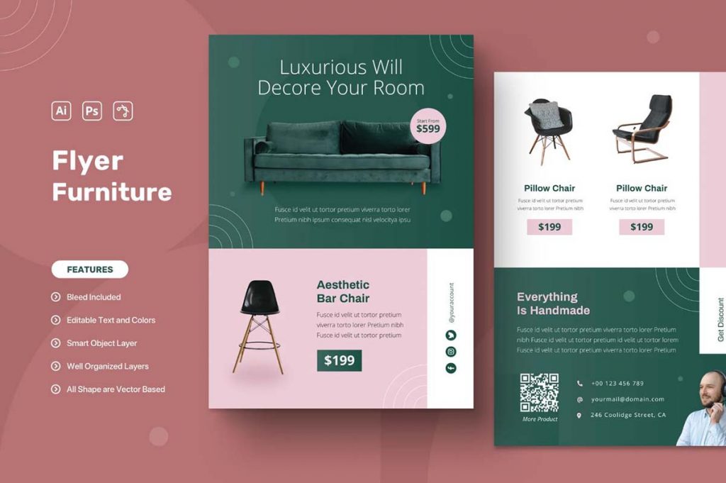
Furniture Sale Flyer Template
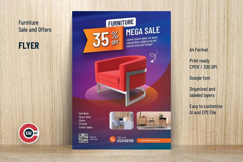
Furniture Store Flyer Template Design
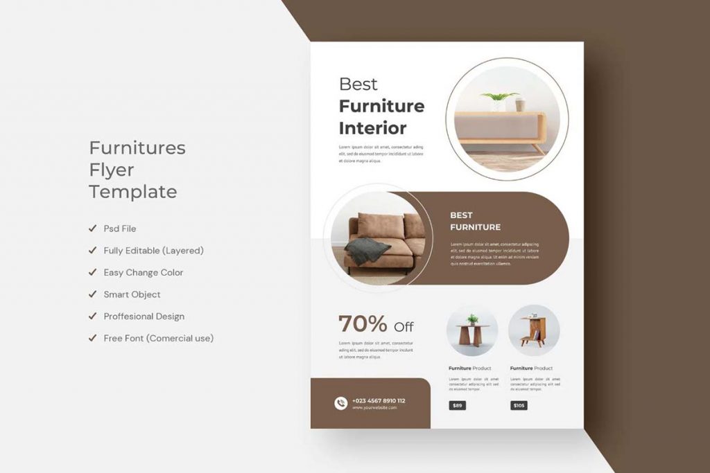
Furniture Product Catalog Flyer
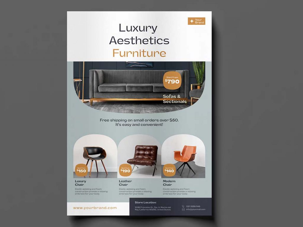
Furniture Store Flyer Instagram Post
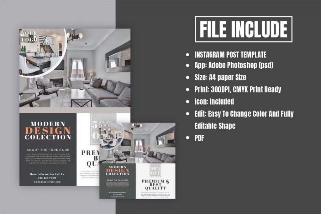
Furniture Sale Flyers
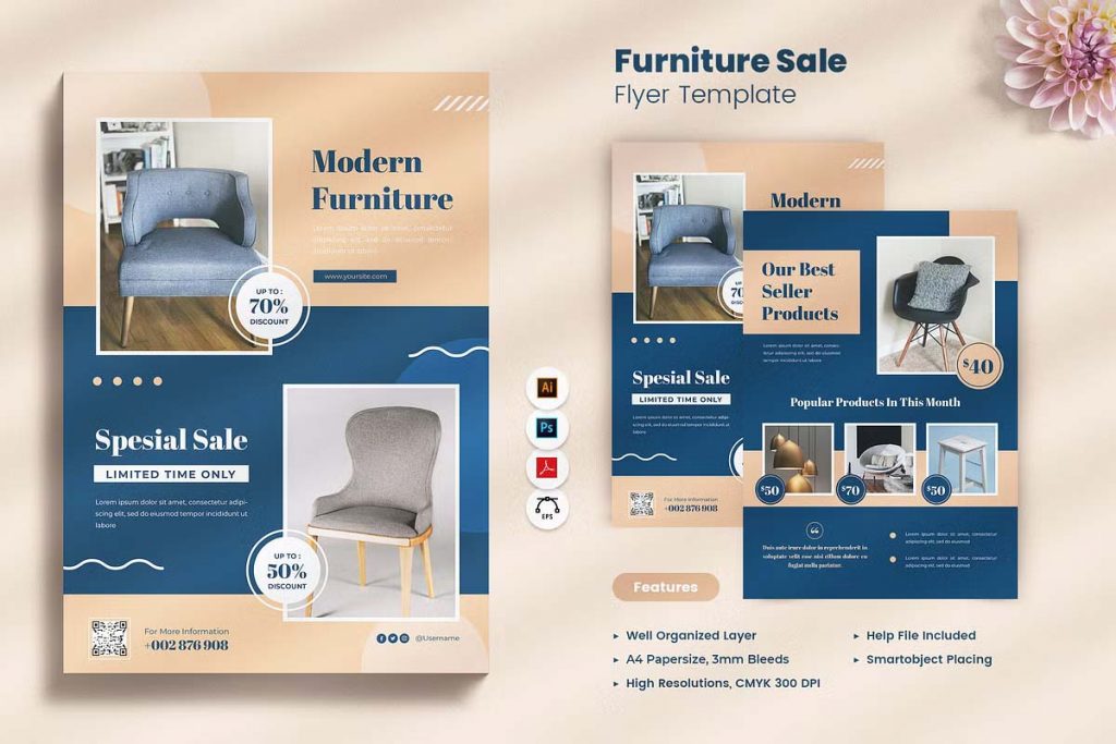
Furniture Product Catalog Flyer
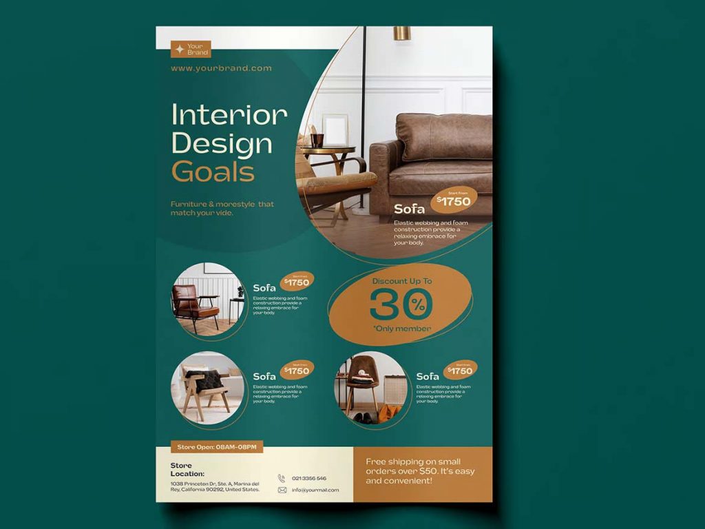
Furniture Store Sale Flyer
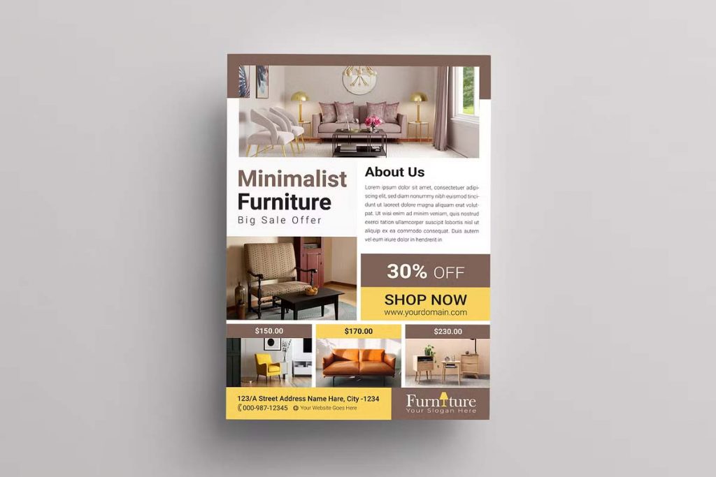
Furniture Product Sale Flyer
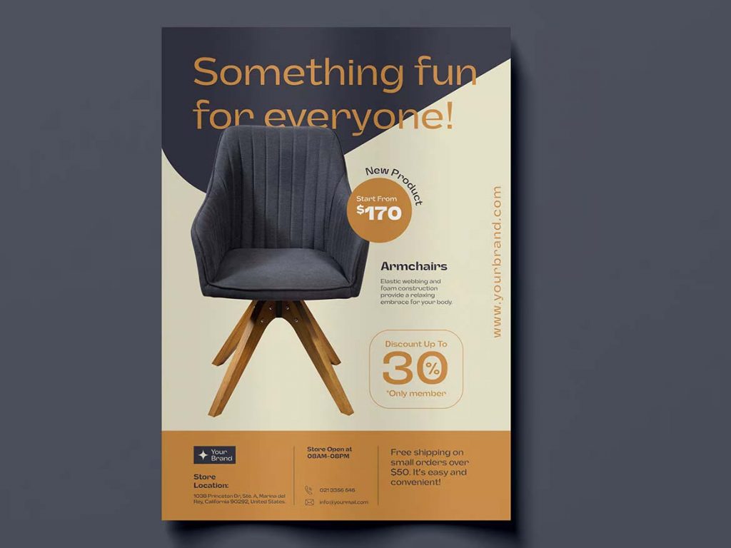
Modern Furniture Store Flyer Template
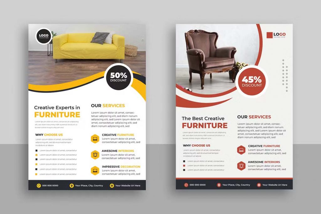
Furniture Sale PSD Flyer
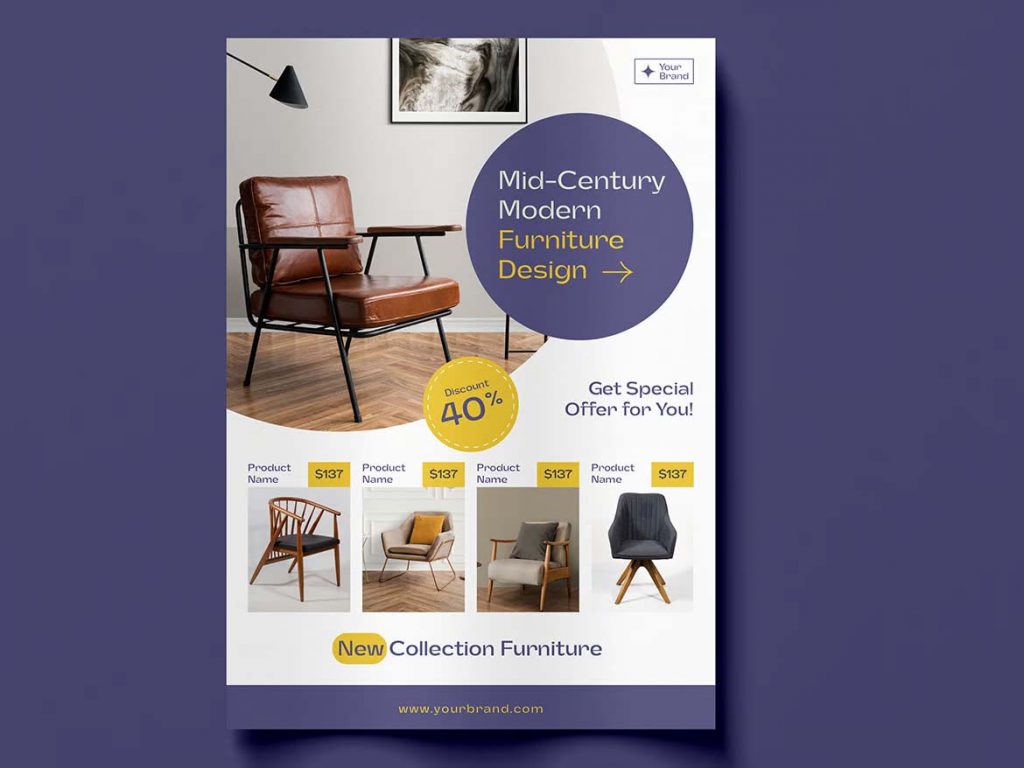
Modern Furniture Store Flyer Template
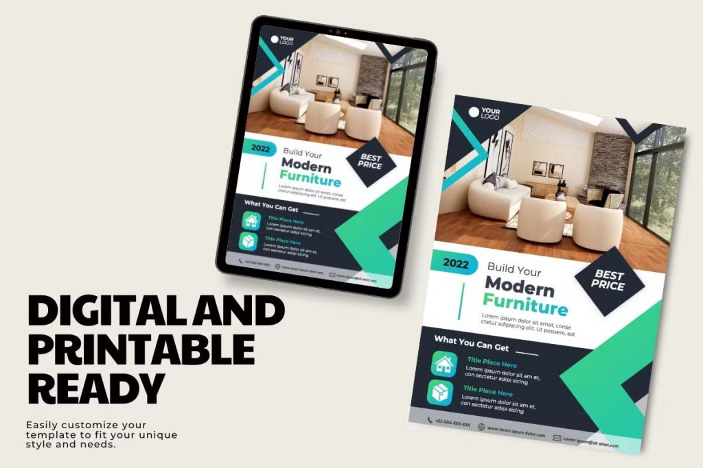
Furniture Product Sale Flyer
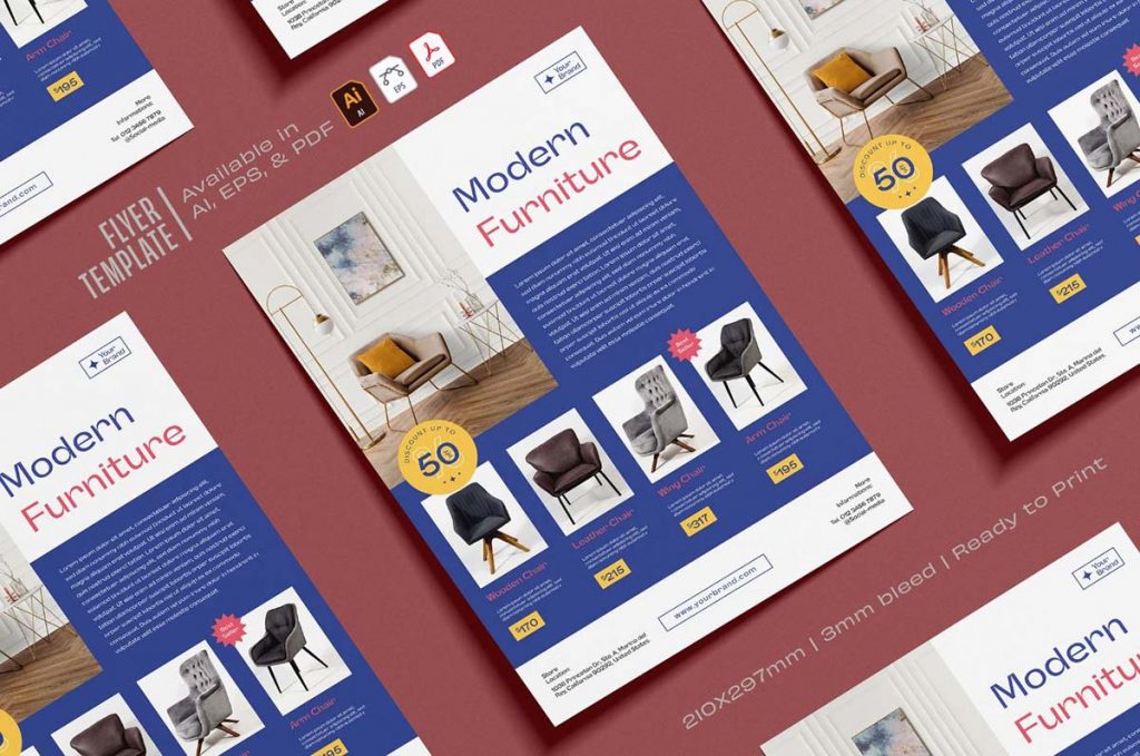
Product Catalog Flyer Template
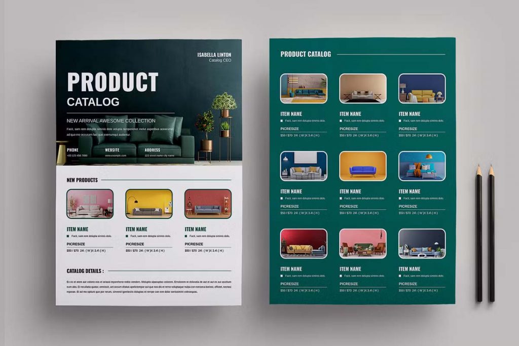
Furniture Product Sale Flyer
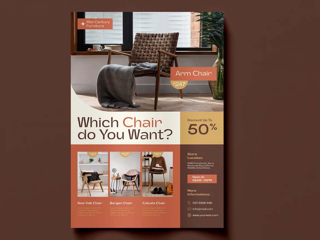
Furniture Flyer Template Design
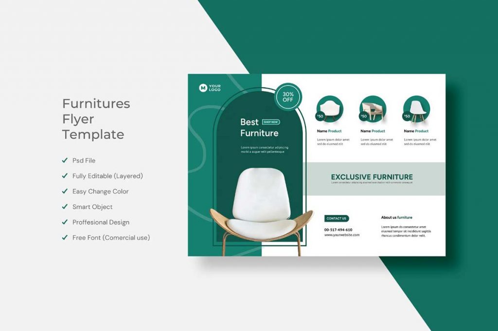
2. Compelling Headlines and Taglines
A powerful headline can make the difference between your flyer being tossed aside or carefully considered. Your headline should be bold, clear, and direct. Whether it’s announcing a major sale, a new collection, or a limited-time offer, make sure it grabs attention. Follow up with a catchy tagline that encapsulates the essence of your brand or the specific promotion you’re running. For instance, “Transform Your Space with Luxury Living” speaks to the desire for comfort and elegance.
3. Highlight Key Offers and Discounts
One of the primary reasons customers hold on to flyers is for the deals. Make sure to prominently feature any special offers, discounts, or promotions. Use bold fonts, contrasting colors, or even icons like stars or arrows to draw attention to these elements. Clearly state the terms of the offer, including dates and any restrictions, to avoid confusion. Consider using phrases like “Limited Time Offer” or “While Supplies Last” to create urgency.
4. Tell a Story with Your Products
Rather than just listing furniture items, consider creating a narrative that connects with your customers. For example, you could craft a story around “Creating the Perfect Cozy Living Room” and feature a selection of sofas, coffee tables, and lighting that all work together to create this ideal space. This approach helps customers envision how the pieces fit together, making it easier for them to make purchasing decisions.
5. Include a Strong Call to Action
No flyer is complete without a clear and compelling call to action. Whether it’s inviting customers to visit your store, check out your website, or call for more information, your CTA should be impossible to miss. Use action-oriented language like “Visit Us Today,” “Shop Now,” or “Call to Reserve Your Favorite Pieces.” Ensure your store’s contact details and location are easy to find and read.
A well-crafted flyer is more than just an advertisement; it’s a tool to inspire and engage potential customers. By focusing on strong visuals, compelling content, and clear messaging, you can create a flyer that not only grabs attention but also drives traffic and sales for your furniture store.


