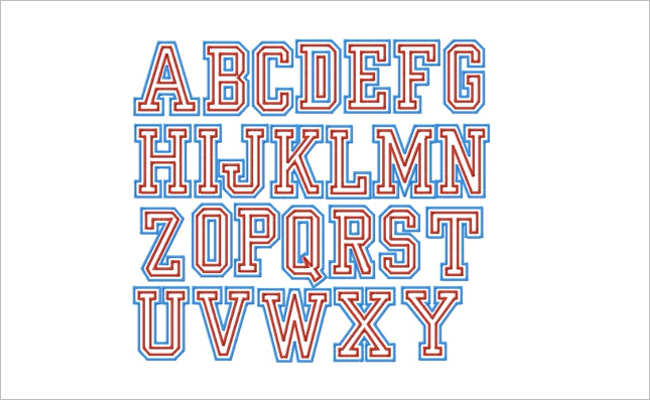
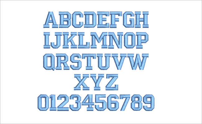
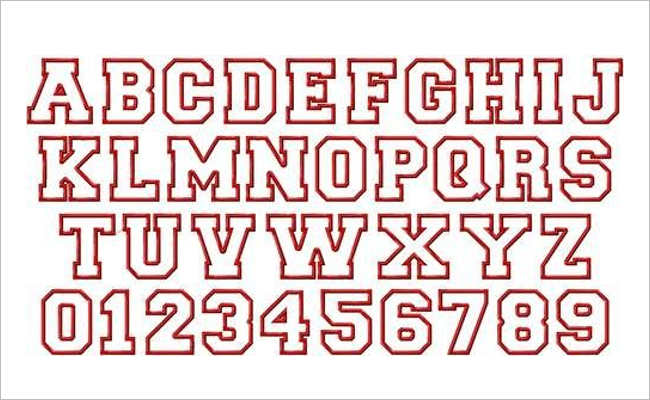
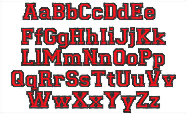
Fonts are more than just letters on a page; they are powerful tools that can convey tone, personality, and style. When it comes to creating designs with a touch of nostalgia and classic appeal, varsity fonts are a go-to choice. These fonts, inspired by the lettering found on traditional sports jerseys and university apparel, exude a sense of athleticism, camaraderie, and vintage charm. In this article, we’ll explore the allure of varsity fonts and how they can enhance your designs.
Capturing Tradition: The Timeless Appeal of Varsity Fonts
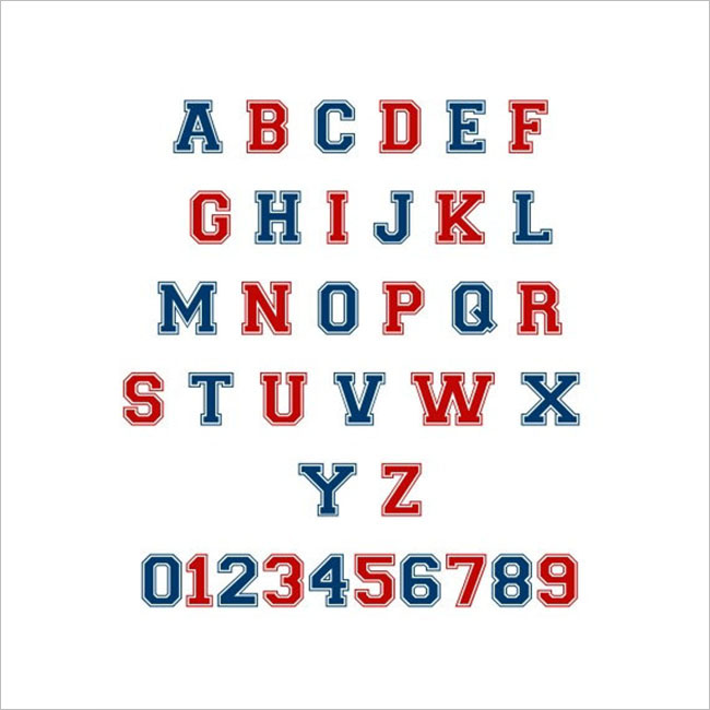
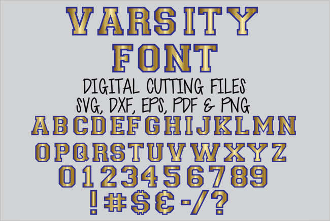
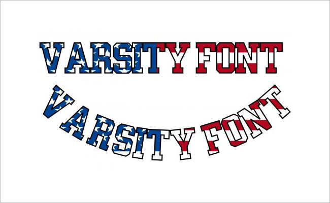
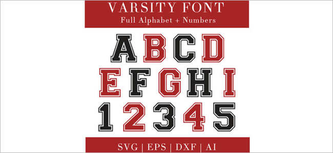
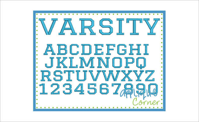
Handy Varsity fonts evoke a sense of tradition and heritage, harkening back to the golden days of collegiate sports and academic excellence. With their bold, blocky letterforms and distinctive serifs, these fonts instantly command attention and convey a sense of authority. Whether you’re designing a poster for a sporting event, creating branding for a retro-inspired product, or crafting a vintage-themed invitation, varsity fonts add a touch of old-school flair that resonates with audiences of all ages.
Versatility in Design: From Athletics to Academia
While varsity fonts are synonymous with sports, their versatility extends far beyond the playing field. These fonts are equally at home in academic settings, lending a scholarly aesthetic to presentations, posters, and educational materials. Whether you’re designing a flyer for a school event or creating graphics for a classroom bulletin board, varsity fonts can infuse your designs with a sense of academic prestige and intellectualism.
Adding Character: Customization and Variation
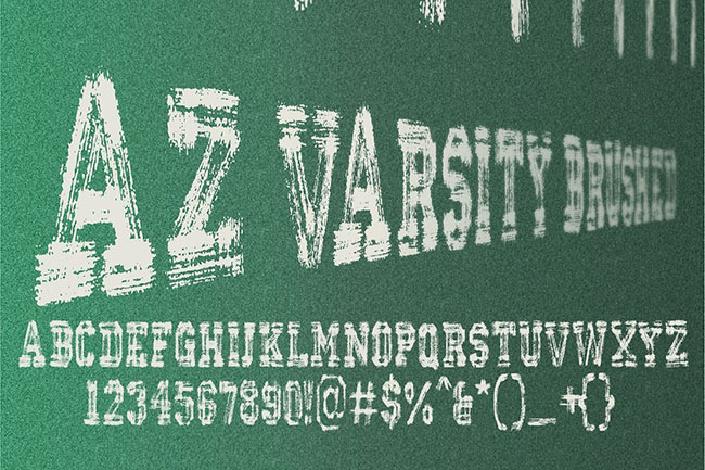
One of the appeals of varsity fonts lies in their customizability and variety. From classic block lettering to more ornate scripts, there’s a varsity font to suit every design need. Whether you prefer a clean, modern look or a vintage, weathered feel, varsity fonts offer a wide range of styles and variations to choose from. Additionally, many varsity fonts come with alternate characters, ligatures, and stylistic sets, allowing for further customization and creative expression.
Pairing and Composition: Creating Dynamic Designs
The key to effectively using varsity fonts lies in thoughtful pairing and composition. When combining varsity fonts with other typefaces and design elements, consider contrast, hierarchy, and readability. Pair bold varsity headlines with sleek, sans-serif body text for a modern twist, or combine vintage-inspired varsity scripts with decorative ornaments and illustrations for a nostalgic feel. Experiment with different combinations until you find the perfect balance of style and harmony.
Conclusion: Making a Statement with Varsity Fonts
In the world of design, fonts play a vital role in shaping the visual identity and impact of a project. Varsity fonts, with their timeless appeal and versatile nature, offer a unique opportunity to infuse designs with character, tradition, and style. Whether you’re creating graphics for a sports event, designing branding for a retro-themed product, or crafting academic materials with a scholarly flair, varsity fonts are a handy tool for elevating your design and making a lasting impression.

