In the fast-paced world of supermarkets, icons play a crucial role in guiding shoppers efficiently through aisles and across digital interfaces. Whether it’s in-store signage, mobile apps, or self-checkout kiosks, icons provide visual shorthand to simplify decision-making. Let’s explore how supermarket icons contribute to a seamless shopping experience.
The Role of Supermarket Icons
Supermarket icons are more than just decorative elements. They are tools that enhance the customer journey, making it easier for people to navigate large, often overwhelming spaces. From simple illustrations of produce to symbols for sections like dairy, household, and bakery, icons create instant recognition. Well-designed supermarket icons ensure clarity and accessibility, cutting down on the time it takes to locate products and services. They cater to a universal language, where visual symbols transcend language barriers.
Supermarket Icons
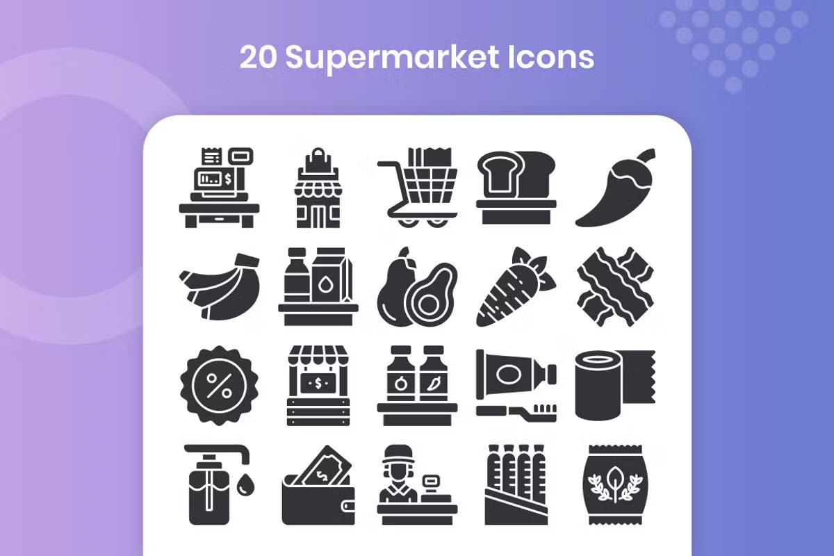
Supermarket Solid Icons
50 Supermarket Icons
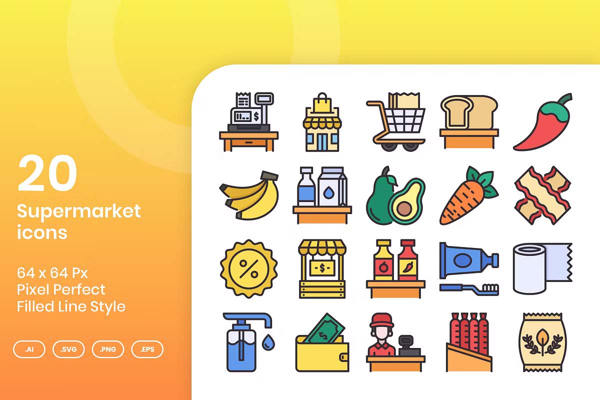
20 Supermarket Pixel Perfect Icons
30 Supermarket Icon Set
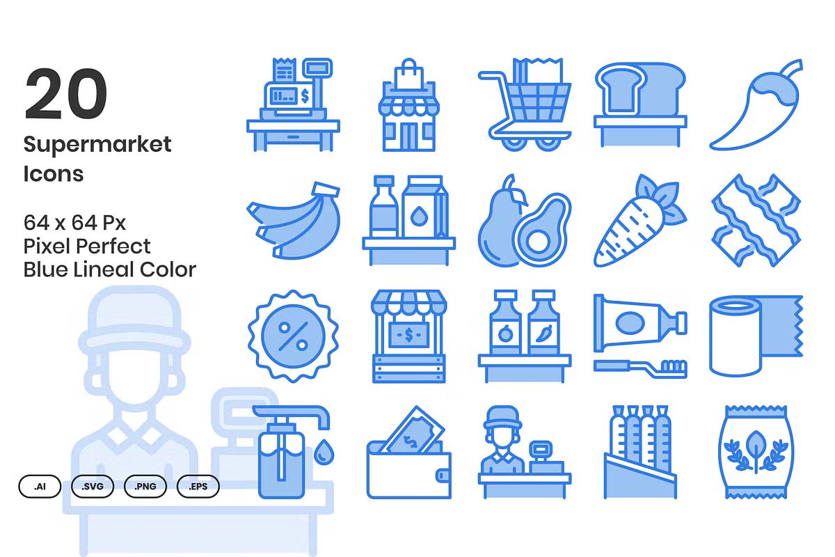
20 Supermarket – Lineal Color
Supermarket icons
20 Supermarket PNG Icons
Supermarket Professional Icons pack
Supermarket Flat icons set
Free SuperMarket Icons
Clean & Modern Supermarket Icons
Grocery Colored Icons
Supermarket 3D Icons
Supermarket Icon Pack
Enhancing the Digital Experience
As more consumers embrace online grocery shopping, the demand for well-crafted icons in mobile apps and websites has surged. Supermarket apps rely on intuitive icons to represent categories, cart functions, and delivery options. A clean shopping cart symbol encourages users to add products, while clear payment icons ensure a smooth checkout experience. Without the ability to physically interact with products, icons become essential touchpoints for customers in the digital space.
Designing for Accessibility
Inclusivity is another key consideration in designing supermarket icons. An effective icon system must be recognizable to people of different ages and abilities. For example, bold, simplified icons with high contrast colors ensure readability for individuals with visual impairments. Consistent iconography also aids customers who may struggle with language, allowing them to shop independently by following clear symbols. Designers must account for different levels of tech literacy, ensuring that both seasoned app users and novices can navigate effortlessly.
Icons and Branding
Supermarket icons are also integral to brand identity. Chains like Walmart, Tesco, and Carrefour use proprietary icon sets that reflect their brand ethos. Minimalist, modern icons may indicate a tech-forward, premium experience, while hand-drawn, organic styles may appeal to eco-conscious consumers. These icons often appear on in-store displays, product packaging, and even promotional materials. By integrating iconography into their branding, supermarkets create a cohesive customer experience across physical and digital touchpoints.
Supermarket icons simplify complex environments, providing an intuitive guide for shoppers in both physical stores and online platforms. They contribute to a brand’s identity, ensure accessibility for all users, and create a streamlined shopping experience. In an age where convenience is paramount, these small yet powerful graphics serve as essential tools in the modern retail landscape.


